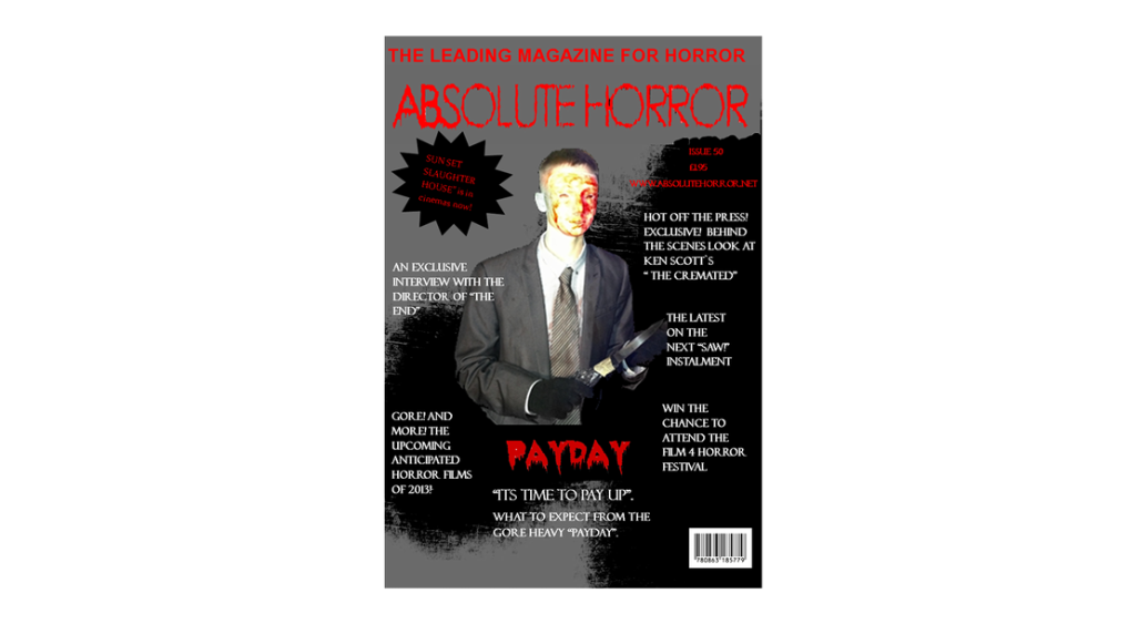
Our finished magazine front cover.
Colour scheme: After analysing the front cover of two issues of "Empire Magazine" we discovered it was very clear from this and our preliminary feedback that the colours of black and red were essential components in terms of the colour scheme of the page. These colours featured heavily on our page besides the white font that was used to highlight anchorage from the "Payday" article and the issue number at the top of the page. The colours work well in terms of pinpointing the cover to the horro genre, as the colour red in particular connotates violence and bloodshed which is a key part of our production in terms of the antagonist that features on the page.
Our image: The image of our villain is centred in the page assisitng in drawing immiediete attention to him and the "Payday" article. The pose of the villain shows him sadistically toying with the knife he is holding that serves to immiedietly highlight one of his characteristics. He is clearly a careless individual which is emphasised further by the costume design. His suit is torn and smothered with blood that promotes him as a killer and a sadisitic one and that due to his lacking of wellbeing for his own appearance. The mask shields his identity and is too smothered with blood prompting an unatural look.
Manditory features: We have included the majority of essential features found on any magazine cover for example we included a barcode, subtitles of other articles found inside, a primary centred image, a large masthead as well as the issue number price and website for additonal information. All of this is essential for ensuring our magazine is seen as a proffessional product and we have been inclined to do so from our preliminary research and feedback.
