Original image.
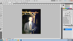
The original image here was edited firstly on "Fireworks" where the photo were we were required to cut and resize the image in order to fit the magazine structure. This also helped us achieve the desired representation of our villain as being photographed in a garden would not allow him to be seen as a serious horror villain in light of his alienation in the setting.
Background.
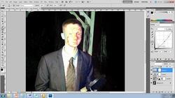
We then proceeded to experiment with the lighting of the picture and ultimately decided to make the background a lot darker by decreasing the contrast of the image which allowed our villain to stand out more ahead of the dark background. This was done on "Photoshop" a program we were familiar with as we had used it predominantly to create our poster.
Face alterations.
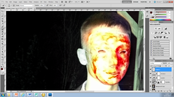
As the original image of the mask appeared lighter than expected we used the brush tool on "Photoshop" to make our villains face alot more darker and blood stained. It served to give him the more unatural appearance that we were looking to achieve.
Final image.
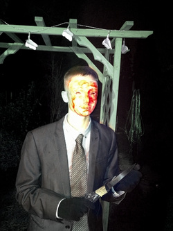
We were left with this final image that was ready for our magazine cover. All that was left to do was the cut the image using the crop tool that allowed us to remove any unnecessary elements of the background.
Font choices.
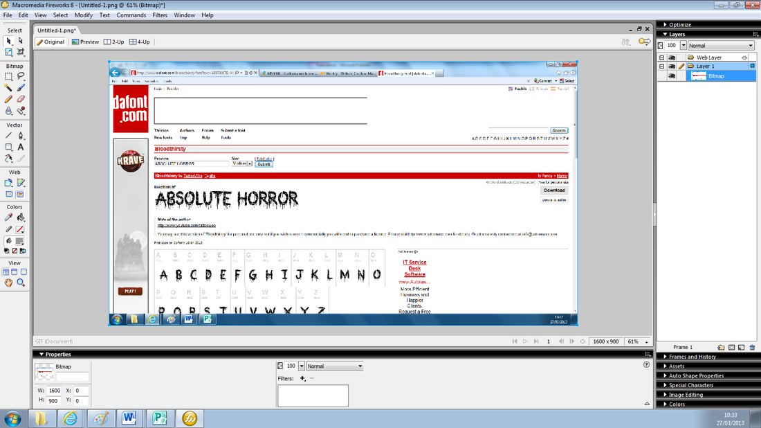
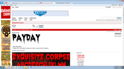
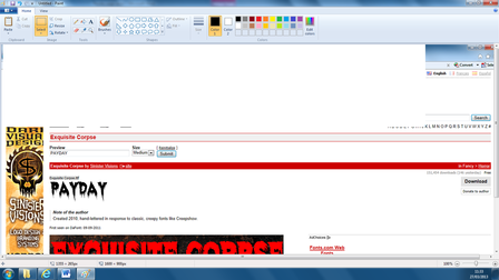
To find a suitable font for our magazine we went to www.dafont.com, a site that specalizes in a variety of font types one of which was horror. We found our first choice font and proceeded to copy it onto the "Fireworks" program.
Fireworks/title.
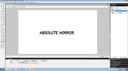
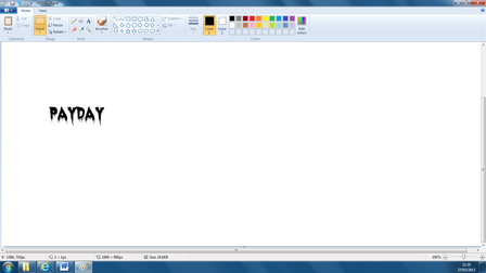
We then cut the unnecessary parts of the print screened photo on "Paint" and then decided on the colour choice of which would be red.
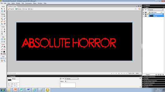
Colouring the font.
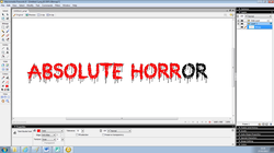
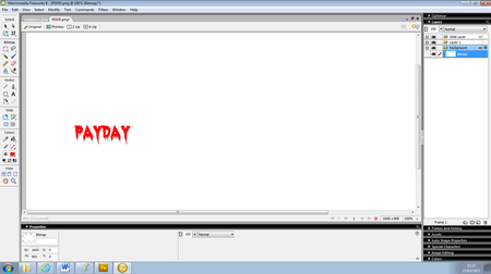
Using the colour filler tool we then altered the font colour from black to a dark red. This would stand out against our dark background.
Other texts.
We applied the same process to other text on our cover e.g. the "Payday" subtitle.

To complete the magazine all that was left to do was to add the barcode which we obtained from Google and copied onto the magazine and add the image and the text. We incorporated several subtitles for other articles that are going to be in the magazine as well as the issue info and price of the magazine, the font used was "Felix Titling" (bold) which was available on the "Microsoft Publisher" program.
